How To: Custom PowerBI Reporting From Intune Data

There are two things that I’m a sucker for when it comes to technology: a great data visualisation (often achieved via PowerBI) and a seamless cloud deployment and management of device (usually by Intune).

This morning I read a tweet from Jannik Reinhard that managed to combine the two of them in a single blog post, so naturally I wanted to read more! As always, I try to credit the original source when I’m inspired to write my own blog based on their content, so check out his tweet here:

And you can read his full post here: Build PowerBi Dashboard based on Intune Data Warehouse – Modern Device Management (jannikreinhard.com)

The genius behind this blog post is the beta feature called the Microsoft Intune Data Warehouse – if you’re wondering what this is, then the documentation states:

The Intune Data Warehouse samples data daily to provide a historical view of your continually changing environment of mobile devices. The view is composed of related entities in time.

Data Warehouse data model – Microsoft Intune | Microsoft Docs

The warehouse exposes data in the following high-level areas:

  • App protection enabled apps and usage
  • Enrolled devices, properties, and inventory
  • Apps and software inventory
  • Device configuration and compliance policies

These are all super helpful things to know and, whilst Intune provides it’s own reports, sometimes you want to drill a little deeper into the data or present it in a way that makes more sense for your own preferences for troubleshooting.

Getting Set Up For Custom Reporting With PowerBI

Jannik’s blog does a great job stepping you through the steps to get set up – honestly, this is only going to take you 2-3minutes. I could screenshot it, but he’s already done this here

The key is to select ‘Get Data’ in PowerBI App and then search for “Intune” in the search box and you should see the connector:

The other super helpful contribution from Jannik is the Intune Dashboard template he’s build and shared on GitHub – you can download it from here. It comes pre-populated with his data, but a simple click of “Refresh” in PowerBI and you’ll be seeing your own data reporting from your tenant.

Sample Data From My Intune Console

Within 5 minutes of reading the original blog I had my own data being visualised and here are the three main views:

Apps

Devices

Config Profiles

One thing that confused me at first was the three buttons at the bottom of the report for App / Device / ConfigProfiles – you can see these highlighted above. I initially thought you could click on these to select each report, but you actually still need to click the tab at the bottom of PowerBI for each report – see below:

Correcting the above – Jannik helpfully reached out on Twitter and reminded me that when using PowerBI Desktop you need to select ctrl+click to trigger buttons in a report. Once you publish the dashboard to www.powerbi.com then you no longer need to hold ctrl+click, but simply click on the button and it will change views. Thanks for the reminder Jannik!

Other than that, the reports work beautifully and the data can be refreshed daily to see the latest snapshot. With a little tweaking of the PowerBI report you can call out out whatever data is most important to you – have fun!

Categories
Microsoft365

How To: Creating an Excel Risk Heatmap

Working in the various fields of education and technology, I’m constantly reminded that we need to be life long learners. In that spirit, I’m sharing something I learnt this week that solved a real world business need for me and hopefully is of use to the readers of this blog.

Example of a Heatmap I wanted to generate

Visualising Data

I’ve admitted before I’m a sucker for a great data visualisation, be that in Microsoft PowerBI or it’s longstanding predecessor: Microsoft Excel. In this case, I was really keen to try and create a risk assessment heat map that would allow me to easily manipulate data points on the heatmap as the risk changed over time. In particular, I wanted to use a visual that would ‘tell a story’ quickly for my bosses that were needing to absorb a lot of data very quickly and did not want to read a bunch of text bullet points that told that story.

Doing some digging online, there was a variety of different ways to achieve this but I wanted to keep it simple and easy to maintain (nod to this clip that eventually pointed me down this pathway).

Create Excel Risk Heatmap in 5minutes

Keeping with the theme that a picture tells a thousand words, here is my 5minute walk through video on creating the heatmap:

Download My Example

My example is super basic, but it may be all you need to get started yourself. To that end, here is my example created in the video for you to download if you choose:

The example heatmap I created in the video tutorial in less than five minutes

So there you have it – a very simple way to create a cool visualisation in Excel to tell a story about risk assessment on a heatmap. Trust this was useful for you!

Categories
Microsoft365 Minecraft:EE

The Ultimate Collection Of Resources For Remote Learning with Microsoft 365

I’m initially composing this in mid-March 2020 and primarily in response to numerous people that have been asking me for a single blog post of resources to assist with all aspects of Remote Learning in education (similar to what I wrote and updated for Minecraft:Education Edution).

The impact of #COVID19 / Coronavirus is being felt globally and so I’ve decided to pool resources from across the internet specifically connected with M365 for Education and breaking it down into the following sections:

  • Classroom Teaching Resources
  • Network & Infrastructure Considerations
  • Tips & Tricks
  • Everything Else!
  • Videos

I’ll update this continuously whilst there is emerging news and requirements – it is not a complete list right now, and I aim for it to be a living document, so check back regularly!

UPDATED 24th April: Added OneNote Best Practice Guidance for IT Admin and Teachers under “Network & Infrastructure Considerations”

UPDATED 11th April: Added Guide to Breakout Rooms in Teams under Classroom Teaching Resources; Calendar of free Education Webinars under Tips & Tricks; Numerous links to articles / documentation explaining security and privacy in Microsoft Teams under Network & Infrastructure Guidance; Video Tips for Students using Office365 under Tips & Tricks; Mike Tholfsen’s guide on Microsoft Teams Meetings – what to use now and what is coming soon under Classroom Teaching Resources; Blog on Remote Work Trends (including Education) – fascinating insights into Teams usage during COVID lockdown under Everything Else!; Update the COVID19 Tracker below

UPDATED 2nd April: Added changes to School Data Sync (SDS) processes for rapid creation of Teams under “Everything Else!”

UPDATED 31st March: Added Mike Tholfsen’s collection of shortlist URL for educators under “Classroom Teaching Resources”;

UPDATED 30th March: Added links to Teams Call Quality reporting with PowerBI Dashboards under “Network & Infrastructure Considerations”;

UPDATED 27th March: Added guide for using Teams in low bandwidth scenarios under “Network & Infrastructure Considerations; Guides to checking in on Student Social and Emotional Wellbeing under “Everything Else!”; YouTube playlist of all RemoteLearning videos from Microsoft Edu under “Videos”;  YouTube playlist of quick tips for teachers in Office365 under “Videos”; Microsoft blog highlighting integration with various LMS and Microsoft Teams under “Classroom Teaching Resources”; Updated the COVID19 confirmed cases as of 27th March

UPDATED 25th March: Added Teams Attendance app under “Everything Else!”

UPDATED 24th March: Added MakeCodeLivestreaming Classes under “Classroom Teaching Resources”

UPDATED 21st March: Added great case study of teaching with Teams & OneNote under “Classroom Teaching Resources”; Added Video Case Study under “Videos”;

UPDATED 20th March: Added information Shifting to distance learning: A 5-day guide for school leaders​ under “Classroom Teaching Resources”; Integrating your existing Learning Management System (LMS) with Microsoft Teams under “Classroom Teaching Resources”; Remote Learning with FlipGrid guides under “Classroom Teaching”; Canvas LMS integrates with Microsoft Teams under “Network & Infrastructure Considerations”; Integration between Schoology LMS and Microsoft Teams under “Network & Infrastructure Considerations”; Updated the COVID19 confirmed cases as of 20th March.

UPDATED 19th March: Added information on Family Learning Centre under “Everything Else!”; Minecraft:Education Edition internet play is possible with Join Codes under “Classroom Teaching Resources”

UPDATED 18th March: Added information size limits of members in a Microsoft Team, on a video call etc in “Network & Infrastructure Considerations”

UPDATED 17th March: Added information around School Data Sync for rapid Teams deployments based on data in your SIS/SMS under “Everything Else!”; Added information on OneDrive File Requests for larger assignments under “Tips & Tricks”; Added information on Digital Signatures to prove document ownership under “Tips & Tricks”; I’ve also added a new VIDEOS section of relevant content.

COVID19 Tracker:

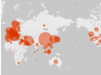
This is a great visualization powered by Bing and PowerBI tracking the current impact of COVID19 – check the latest data here and the snapshot below has been updated as of 20th March (approx 73K more confirmed cases in three days!)

COVID2019
Data as of 20th March 2020

The spread of COVID19 is rapid – see latest numbers below as of 11th April:

COVID
Data as of 11th April 2020

Classroom Teaching Resources

Whilst there are a huge amount of tools inside of Microsoft 365 for Education, perhaps the most “in demand” in times of remote learning is Microsoft Teams and the great news is this is available at no cost as part of the A1 Education offering from Microsoft.

Network & Infrastructure Considerations

It’s important that educational institutes have configured their environments to work smoothly under increased load – the following guides are best practice and an awesome starting point:

Tips & Tricks

Everything Else!

Videos

Sometimes seeing is believing, and I’m going to embed some easy videos to consume directly inside the blog:

  • Online classes and lectures with all your students. Part 1 class setup

  • Online classes and lectures with all your students. Part 2 schedule online meetings

  • Dutch kindergarten students explaining how to use Teams for remote learning, including on an iPad and iPhone (there are English subtitles)

  • My video showing how you can use Join Codes in Minecraft:Education Edition to connect wtih friends over the internet – full details here.

  • Video case study of remote teaching using Teams and OneNote in Hong Kong – make sure you turn on the CC subtitles for English translation:

  • Playlist on YouTube of all Microsoft Education Remote Video Guides:

  • Quick Tips in Office365 YouTube Playlist:

Conclusion

It’s super important that communities come together at this time to support each other, support our wonderful educators and school leaders and ensure that our students are feeling loved and supported during these rapidly changing times.

If you’ve got awesome links that I can include feel free to make a note in the comments or drop me a DM on Twitter over at @samuelmcneill

Categories
Microsoft365

Tracking Student Literacy Progress With Power Apps And Microsoft Teams

I’m always impressed with the ingenuity of teachers and how they can take a number of different products and blend them together to make an awesome tool to solve an existing challenge. Teachers are constantly challenged for time and the requirement for accurate tracking of student progress contributes to a significant administrative work above and beyond the core classroom teaching.

I came across this blog post today that talks about Assistant Principal Lauren Taylor who tackled this challenge head on, building a digital replacement to track student literacy progress by combining access to tools included in Office 365 such as:

TacomaSchoolDistrictSolutionArchitecture.png
The architecture of the solution used at Tacoma Public Schools

Again, I really encourage you to read the entire article to learn more about how this works, as it is super impressive what Lauren Taylor achieved and her ‘a ha’ moment was when she realized she could visualize her student’s data using PowerBI and other teachers could access this without needing to see her own paper records of the student testing.

ReadingCharts.png
Reading records of students, visualized in PowerBI but collected using the simple interface of PowerApps

I’ve worked with PowerBI to visualize student data in previous roles (examples here) and it’s an intuitive yet powerful tool for teachers to get deep insights into their students’ progress.

The great part about using PowerApps and Flow is that is a low/no code platform meaning it’s not difficult for teachers to pickup and start building a solution for themselves to meet a specific point of need, as demonstrated by Lauren in this example. It also has deep integration into other O365 applications such as Sharepoint Online and PowerBI allowing for a seamless flow of data.

Integration Into Microsoft Teams

The icing on the cake for me in this solution was the integration into Microsoft Teams. I’m seeing many schools quickly adopt Teams in a range of different contexts because it is so flexible at integrating other platforms into it. It really is a digital hub for all things in the classroom and Lauren Taylor said:

Many teachers are not tech-comfortable – putting it [PowerApps and PowerBI] in Teams made it easy to use for everyone

ManitouParkClass
This screenshot shows the PowerApp embedded into Teams making it accessible in a familiar context for all teachers and support staff.

DRA-Data
Similarly, PowerBI was embedded into Teams, allowing teachers to see the output of their student progress, all within the same platform.

My Thoughts:

Digitally streamlining the recording of student assessment has many benefits: it’s stored in the cloud meaning it can’t be lost, can be shared with other educators and just saves so much time. Allowing teacher-aides to get access to data ahead of their engagement with students means they are better prepared and know what strategies they will need to support the student towards their learning goals.

PowerBI is easy to learn to use, yet provides powerful data reporting making it a perfect fit in schools wanting to increase their data-driven decision making. However, it is the seamless integration of all of the above into Microsoft Teams to deliver a unified platform for teachers to keep it super simple to use these tools that is the real winner. As I stated at the start of this blog: teachers are time-poor; providing a myriad of tools in a single platform to record their data and also review the reporting is a significant time saver for them.

Read the original article in full here.

Categories
Microsoft365

Enhancements to PowerBI Email Subscriptions

Back in June 2017 I wrote about the new email subscription service arriving in PowerBI. At the time, I called out how this would be super helpful in an education context:

In an education context I can see this being super helpful for Executive and Enrollment Teams where they need to track time sensitive data e.g. how many beds remain in the boarding house? What is the gender split in Year 10? How many students have passed their internal assessment before the end of the year?

I see that there is an enhancement made to this feature this week that allows for time based policies for emails – in other words, set the day/time you want the report to show up in someone’s inbox and it will appear. Previously, this was only happening when the data set was refreshed, so this added functionality provides significantly more flexibility in terms of getting the data in front of the key decision makers when they need it.

subscribepanel.png
There are quite a few flexible options when it comes to configuring the scheduled email report.

Personally, I think the real value of PowerBI is the interactive nature of the dashboards, allowing the end user to interrogate the visualizations to understand more deeply what the data is telling them about their business. In saying that, I recognize that many senior leaders who are very busy simply want an overview to appear on a routine schedule in their inbox to provide the top level insights they need to process.

This new feature allows for precisely that, along with a setting that optionally grants the recipient of the emailed report access to the underlying dashboard. This is probably the best of both worlds and by serving the content up via email on a routine schedule, it may encourage the recipient to further investigate the data themselves – helping them on the journey to become “data curious!”

If you dig through some of the questions at the bottom of the announcement, you;ll notice there are a few additional features coming soon too:

  • Ability to schedule monthly reports (not just daily/weekly)
  • Making the reports contextually aware of saved filters
  • Excel / PDF formats coming (not just the current HTML emails)

It’s great to see the continued evolution of this service.

Video: Embedding Options In PowerBI

Two blogs in a row about PowerBI, both inspired by Guy In a Cube!

I’m not going to make a lot of comments about this, as it’s really just a placeholder to direct people towards who regularly ask about how to embed PowerBI reports.