Categories
Microsoft365

How To: Monitoring Student Engagement In Microsoft Teams

UPDATE 24th November: After experimenting with the updated Insights app in Microsoft Teams I have some additional observations:

  • The Insights App updates student activity fast – like, really fast. I worked as a student in my demo tenant and then check the Insights app as the teacher of the Team and could see the activities within 1-2minutes of them being done:
Snapshot from Insights app showing the channels, tabs and files I’d viewed as a student, along with which files I’d edited and the number of posts I’d made.
  • This got me me thinking that the Insights app could go someway towards answering that question many teachers ask when it comes to device usage in classrooms:

How do I know if my students are working on the tasks I want them working on, when all I can see is the back of their laptop screens?

  • Whilst I would always promote active teacher engagement with students by wandering around the room and doing visual and oral check in with students as part of good classroom practice, the Insights app would allow a teacher to see if the student has opened the required files and edited them in close to real time, during an actual lesson.
    • This could be especially helpful if teaching a hybrid class with students not physically present in the class
    • With sufficient planning and scaffolding, the various activities captured by Digital Activities reporting in the Insights app could allow a teacher to structure a clear learning pathway inside of Teams, similar to what a traditional LMS might afford e.g.
      • Start at a certain channel and make a post in the Conversations tab e.g. what your inquiry question is going to be (logged by Channel View in Insights)
      • Find one other question posted by a classmate and leave a reaction to it (logged by Reactions in Insights)
      • Navigate to the Files tab in the channel and open the template exemplar (Files opened logged by Insights)
      • Create your own file and complete your inquiry (edited files logged by Insights)
    • If the Insights App was showing that students were not ‘on task’ by their lack of activities, the teacher can easily spark a conversation with them to see if they need assistance with the work, or a reminder to stay focused to meet the completion time frames of the assigned task.

Looking for resources and training to get started?

Background to my love for data

I have been interested in educational analytics for years now, and many of my early forays into collecting student data were using freely available and often Open Source solutions. It was in my previous role as Director of ICT at St Andrew’s College that I caught the love of blogging and you may be interested to read some of my posts around data collection and analysis with a view from insight a school. Some notable call outs:

  • Digitizing, anonymizing and securing the voting of student leaders. This was a solution I was thrilled about as it had a real and immediate impact on the College.
  • Another favourite, this time using the Open source Learning Management System Moodle and some custom scripts to visualize student attendance and grades on each course, both for teachers and students.
A GIF showing how the visualization of attendance would appear to a student when they went to a Moodle course (this one loops, for students it would be drawn once)
  • We soon started exploring how we could use some of the Microsoft tools for data collection, processing and visualization which started with tools like MS Query, Excel and eventually led to PowerBI
  • Pastoral Care seemed an obvious place to get started with increased data visualization and we pulled data from a range of different sources and built dashboards in PowerBI that leveraged Row Level Security, meaning teachers could only see the data on the students in their classes.
  • A last one to perhaps check out is how we started reporting on student academic progress – some videos here showing the dashboards as they looked in 2016:

One other area I wanted to use reporting was across the Moodle LMS to see what touch points and telemetry we could gather to get insights into student engagement. One of the real strengths of Moodle and its open source foundation, is that anyone in the community can build plugins and modules that other users can implement and tweak. I picked up the Engagement Analytics plugin and deployed this for insights. This provided some interesting insights through reports similar to the below:

Source

Engagement, according to this plugin, was defined as:

The Engagement Analytics block provides information about student progress against a range of indicators. As the name suggests the block provides feedback on the level of “engagement” of a student, in this plugin “engagement” refers to activities which have been identified by current research to have an impact on student success in an online course. The plugin was developed as part of a NetSpot Innovation Fund project by Monash University (Project manager: Dr Phillip Dawson), with code by NetSpot developers (Ashley Holman and Adam Olley).

From the project plan: “We intend to implement a block that teachers can add to their Moodle course that will provide them with a quick graphical snapshot of which students are at risk.” (Dr Phillip Dawson)

Currently the plugin has three indicators: – Forum activity – Login activity – Assessment activity

Engagement Analytics Plugin – MoodleDocs

This immediately turned up some interesting insights with teachers able to observe the “lurker” phenomenon: students that regularly logged in, would go to (and presumably read) class forums, but rarely, if ever, post. This would become very obvious from a quick scan of the engagement analytics and aid the teacher in prompting those students with a “next step” activity to move from reading to contributing.

Another insight this revealed was that many students who rarely contributed to class discussion, were over very active and ‘vocal’ on forums – a place where they could think through their answer first in detail, and then draft and post an asynchronous response. It highlighted that whilst some students felt uncomfortable or perhaps less confident in ‘real time’ back and forth discussion typical in many classrooms, they were more than capable of contributing excellent answers in a classroom forum activity.

Updates to Microsoft Teams Insights App

Insights were added to Microsoft Teams for Education over a year ago and during the COVID19 Pandemic, provided a valuable touchpoint for teachers on what and how students were engaging with during distance learning. If you’re new to Insights then this support article is critical as a starting point as it shows how to add the app to your Teams and get started.

It was really great to see that last week the Insights team released a blog post showing that there are 6 new ways you can track student engagement in your classes. As always, I encourage you to read the original blog post in full here, but if you’re in a rush, see below for the six new features:

  1. See engagement across multiple classes
  2. Drill down to specific activity within a class
  3. Get spotlights of student behavior and individual habits
  4. See overall student activity (or inactivity) on Teams
  5. Drill down to see synchronous class behavior (aka Teams meeting behavior)
  6. Get quick access to class grades and grade distributions

The big shift here with Insights is the ability to get greater information around outliers e.g. immediate identification of students that have been absent from online class meetings, and even “habits” – i.e. alerting you to which students have been working on assignments very late at night, or very early in the morning.

Of the above features, it’s the first four that appeal to me the most:

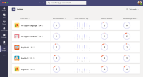
Seeing a snapshot of all the classes I teach and noticing any trends or outliers at a glance that would encourage me to dig deeper is a wonderful time saver for teachers. Source
Drilling down into a class level reveals the new “Activity” and “Habits” cards that give a teacher the ability to see more information about students in the class. This is AI working to complement the classroom observations of a teacher and surface up “just in time” alerts to assist the teacher in followup actions Source
Habits are revealing – learning that some students are constantly working very late at night or early in the morning can lead to instructive conversations between teachers and students and reveal potential distractions or blockers to effective learning. These new student behaviour and habit cards are a great insight for teachers. Source
This is perhaps my favourite – the ability to see individual student activity (or inactivity!) by hovering over a student’s bar, the teacher can see what files they have been editing (and when), as well as any posts or reactions they’ve made in the class Team. This insight solves one of the challenges teachers always ask “how can I tell if my students are working on the documents / activities I need them to be working on when all I see is the back of a laptop screen?”

My Thoughts

Insights are only as useful as the actions they generate.

I remember teaching a student History and Moodle Engagement Analytics revealed that he was mostly doing his homework submissions and forum posts after 1am. This insight prompted me to have a conversation with him which led to me learning he was working the late shift at Kentucky Fried Chicken to help pay the rent on the family home. This sparked a great discussion on how we could modify homework expectations for him so he could continue to support his family financially whilst still progressing his academic study.

When I look at these new Insights from the team I’m excited because it’s the perfect tool to assist teachers who we all know are time-poor. Leveraging high level dashboard overviews across all classes provides the starting point for a teacher with insights. In my experience, when a teacher starts getting useful data insights they become what I call “data curious” and love to dig deeper and ask more questions of the data. This can lead educational institutes down the pathway of creating bespoke data warehouse platforms for reporting, but with these new Insights with Teams, this will fill that need for many teachers with no customization required.

Here is a video from Mike Tholfsen showing how the original Insights App can be installed and works:

Categories
Podcast

PODCAST: #EDUTECHTALKS #7 – Uncovering The Story Behind Education Data with Jake Wills

The seventh podcast between Amit Pawar and myself in our #eduTechTalks series is now available on all major Podcast Platforms and features Jake Wills, an educator and school leader in New Zealand with a passion for data – click below to listen or here to launch.

REMINDER: this edition, along with all previous podcasts we have published, is now also available on Apple Podcasts – SUBSCRIBE HERE to automatically receive each podcast when published.

In this episode, we how data analytics is transforming education through unique insights into student performance. This is a topic of particular interest to me, given a major analytics program I kicked off using PowerBI.com when I was still the Director of ICT at St Andrew’s College. You can read more about the work I did there in the blog posts here. I’ve also blogged more recently on Data Analytics that can check out here.

For now, sit back, relax, and enjoy the latest podcast featuring Jake Wills.

Azure For Students With Free $100 Credit

Azure For Students.PNG

A short post referencing a recent announcement saying fact that verified students can now get $100 free credit towards any of 25 different Azure Services.

Active Your Free Credit Here

From the announcement:

You can start building with any of the free services and use your Azure credit to spend right now:

  • Discover the flexibility of Azure through our vast library of open source services.
  • Deploy Azure Virtual Machines including powerful GPUs with support for LinuxWindows ServerSQL ServerOracleIBM, and SAP. Azure gives users the flexibility of virtualization for a wide range of computing solutions.
  • Build Web and Mobile Apps quickly using .NET, .NET Core, Java, Ruby, Node.js, PHP, and Python. Integrate Azure App Service into existing frameworks and get unparalleled developer productivity with cutting-edge capabilities such as continuous integration, live-site debugging, and the industry-leading Microsoft Visual Studio IDE.
  • Artificial Intelligence and Machine Learning infuses apps, websites, and bots with intelligent algorithms to see, hear, speak, understand, and interpret a user’s needs through natural methods of communication. Enabling computers to learn from data and experiences and to act without being explicitly programmed.
  • Harness Big Data by analyzing all data in one place with no artificial constraints with Azure Data Lake Store. Data Lake Store can store trillions of files and a single file can be larger than one petabyte in size—200 times larger than other cloud store options.

To claim the free credit you do need to be honest as there is three criteria you need to acknowledge:

Azure For Students 2.PNG

If you are a student who meets the above criteria, or teaches a student interest in learning to develop for the cloud, then sharing this great offer would be appreciated.

The Future Is Here – AI Bots & Student Analytics

The video above is a recording of the presentation Tim Davidson from the Auckland University of Technology delivered at the Intergen Convergence 2017 conference. I had the pleasure of meeting Tim earlier in 2017 and seeing some of the work he described in the video above and was suitably impressed both by what they had already accomplished and by the ambitious vision he had for future developments. Tim works in the Strategy and Planning Team at AUT as the Manager of Business Intelligence, Strategy

Kauri
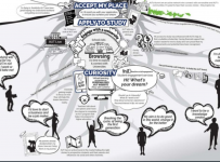
The Kauri Tree of learning at AUT

and Planning. When I chatted with him he explained this was very freeing as it allowed the team to be “ultra agile” rather than being bound by the usual governance and regulatory precautions common in traditional ICT teams. When they came up with a good idea, they could explore it immediately, and he echoes this development cycle towards the end of the video (see below for some indexed reference points).

There is an introduction to the presentation by Steve Scarborough (GM of Dynamics Solutions at Intergen) and then he hands over to Tim to deliver some live examples of the systems at work. The slides are as follows:

Indexed Shortcuts In The Video:

If you don’t have time to watch the full video, I have referenced a few key areas that I encourage you to skip to:


  • Tim explains the BI journey at AUT and how the Deputy Vice-Chancellor at the time was looking to explore any correlations between student success and student satisfaction.
  • The benefits of being in Strategy and Planning and not the ICT Department.
  • The use of Bots and Artificial Intelligence (AI) at AUT – a live demonstration showing there are now multiple layers of bots e.g. one that works out the intent of the user’s question and then pass off the query to another bot.
  • Learning Analytics at AUT – Tim demonstrates some of the features trying to predict students who may not be successful in their studies so early intervention can occur. This take standard data such as what high school they attended, what their NCEA results were like, when they applied/enrolled, but then mixes in live engagement data e.g. are they using library services? Do they log into the Learning Management System? They even combined network access data (wifi, printing, AD authentications etc) and then compared them to scheduled class times as a form of attendance record keeping.
  • Machine Learning – Tim explains “you don’t need to be a data scientist anymore to do Machine Learning” before giving some examples from AUT. He goes on to explain the importance of preparing your data cleanly in a data warehouse as this will simplify future interactions you have with the data.
  • Development Cycle “How We Do Stuff” – Tim concludes his session with a brief overview of how his team works based on five key pillars that whilst they sound familiar, definitely have some unique tweaks to them:
    • Vision
    • Strategy
    • Documentation
    • Speed
    • Selling & Sponsorship

Final Thoughts:

There is a lot to like about the work coming out of AUT in the area of AI, Bots, Big Data and Learning Analytics. The key is they’re storing as much data as possible, even if they do not have an immediate use for it. This enables them to quickly apply historical data sets to new models or reports they build without necessarily having to wait to generate the data.

Additionally, Tim’s team looks for the “low hanging fruit” – the easy wins to convince the leadership team that the data is important and can make a difference in the experiences and outcomes of students. Importantly, they look to share these stories quickly, enabling other faculties or staff members to be inspired about what they could also do with data.

Finally, they’re keeping across the very rapidly changing sector and release of tools and features. Admittedly, this is not easy to do and it is hard to balance the competing demands of delivering (and implementing) completed reports and tools versus up-skilling in the latest features and tools and Tim acknowledges this tension in his presentation.

For me, this presentation reinforces the clear direction of technology in education and how traditionally “back end” services like data and analytics are now front and centre in the life of students – even if they are only ever experiencing it first hand through a bot on FaceBook Messenger!


Video: Embedding Options In PowerBI

Two blogs in a row about PowerBI, both inspired by Guy In a Cube!

I’m not going to make a lot of comments about this, as it’s really just a placeholder to direct people towards who regularly ask about how to embed PowerBI reports.

Measuring The Impact Of PowerBI: Usage Analytics By User

Having led the design and launch of a major PowerBI project in K-12 in a former life, one of the things that bugged me was the difficulty in truly measuring how much impact and usage of these new reports was actually happening amongst the staff. At the time, I cobbled together a few filters on our Fortigate firewall to show me traffic to PowerBI.com, however I freely acknowledged at the time this was a bit of a blunt force instrument for what I was trying to find out.

Enter PowerBI Usage Metrics back in June. This was a significant step forward in the sense that it started to reveal which reports were being more actively viewed compared to others. Accessing this content was very easy:

PowerBI1
To be able to view the Usage Metrics you needed to have Edit permissions to the report itself, thus enabling a simple way to restrict access to this key information.

The Usage Metrics allowed you to slice on a few variables, including whether the report was accessed via the web or the mobile app e.g.

PowerBI2

Once you’ve created a copy, you’ll get full access to the underlying dataset, allowing you to fully customize the usage metrics report to your specific needs. You can even use Power BI Desktop to build custom usage metrics reports using the live connection to Power BI service feature.

This announcement, whilst exciting, seemed to lack key feature that I would be looking for if I was trying to drive uptake with this type of tool across a staff group or team – the ability to see exactly who was accessing the reports. It’s imperative to understand which teams or departments are utilizing BI and then try to observe if this is having an impact on performance.

With an announcement today, you can now see exactly who in your organisation is accessing the content meaning you can do a few things:

  1. Talk to the most frequent users of reports and find out what is working for them and what they would like to see improved / added to the reports.
  2. Identify those users that are still not making use of this type of data and provide some coaching sessions on how they can use this data to improve their performance or add value in their role.

PowerBI3.jpg
Note on the right showing user access to reports

Tip: the UserGuid (aka Object ID) and UserPrincipalName are both unique identifiers for the user in AAD. That means if you export the usage metrics data, you could join the usage metrics data against more data from your directory, like organizational structure, job title, etc.

PowerBI4

Additionally, there are new features for IT Admins to control access to Usage Metrics that are worth reading about here. The following table shows what metrics are available within Usage Metrics:

What metrics are reported?

Metric Dashboard Report Description
Distribution method slicer yes yes How users got access to the content. There are 3 possible methods: users can access the dashboard or report by being members of an app workspace, by having the content shared with them, or by installing a content pack/app. Note that views through an app are counted as “content pack.”
Platforms slicer yes yes Was the dashboard or report accessed via the Power BI service (powerbi.com) or a mobile device? Mobile includes all our iOS, Android, and Windows apps.
Report page slicer no yes If the report has more than 1 page, slice the report by the page(s) that was viewed. If you see a list option for “Blank,” that means a report page was recently added (within 24 hours the actual name of the new page will appear in the slicer list) and/or report pages have been deleted. “Blank” captures these types of situations.
Views per day yes yes Total number of views per day – a view is defined as a user loading a report page or dashboard.
Unique viewers per day yes yes Number of different users who viewed the dashboard or report (based on the AAD user account).
Views per user yes yes Number of views in the past 90 days, broken down by individual users.
Shares per day yes no Number of times the dashboard was shared with another user or group.
Total views yes yes Number of views in the past 90 days.
Total viewers yes yes Number of unique viewers in the past 90 days.
Total shares yes no Number of times the dashboard or report was shared in the past 90 days.
Total in organization yes yes Count of all dashboards or reports in the entire organization which had at least one view in the past 90 days. Used to calculate rank.
Rank: Total views yes yes For total views of all dashboards or reports in the organization over the past 90 days, where does this dashboard or report rank.
Rank: Total shares yes no For total shares of all dashboards in the organization over the past 90 days, where does this dashboard or report rank.